 Database Tutorials MSSQL, Oracle, PostgreSQL, MySQL, MariaDB, DB2, Sybase, Teradata, Big Data, NOSQL, MongoDB, Couchbase, Cassandra, Windows, Linux
In this article we will create a simple dashboard with Kibana. First we need to connect to Kibana and create an Index pattern. For more information about Kibana and Elasticsearch, go to the Analytics && BI-> ELK tab in the menu.
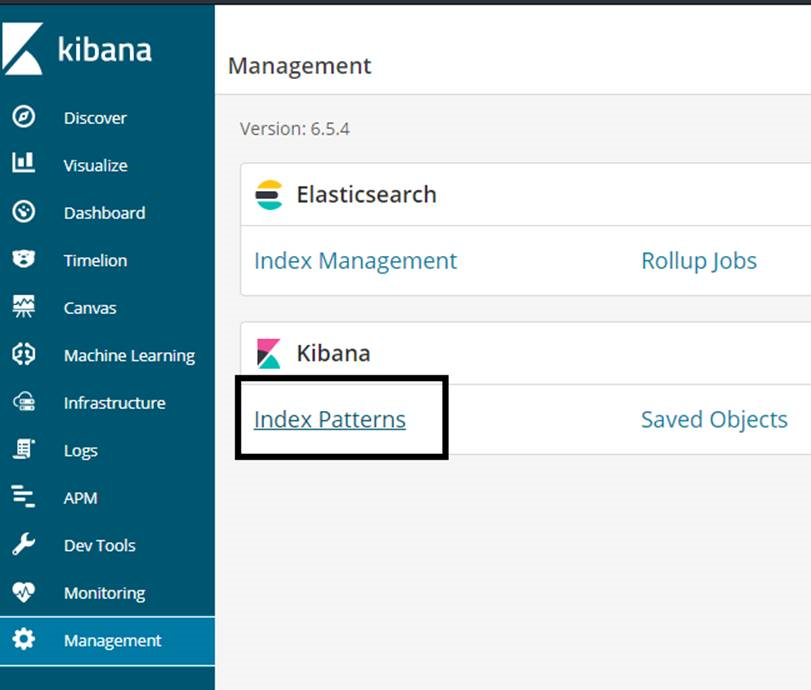
After connecting to Kibana to create index pattern, we click on Index Patterns from Management as below.
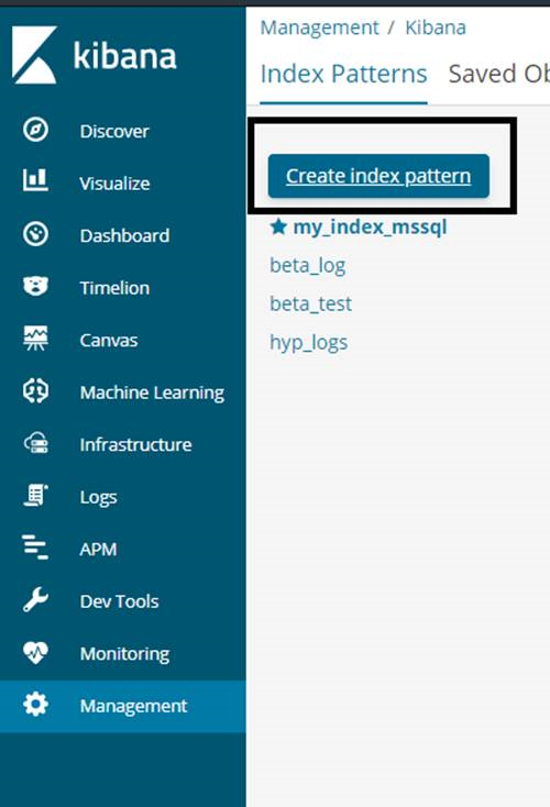
Then we click Create index pattern from the screen that appears.
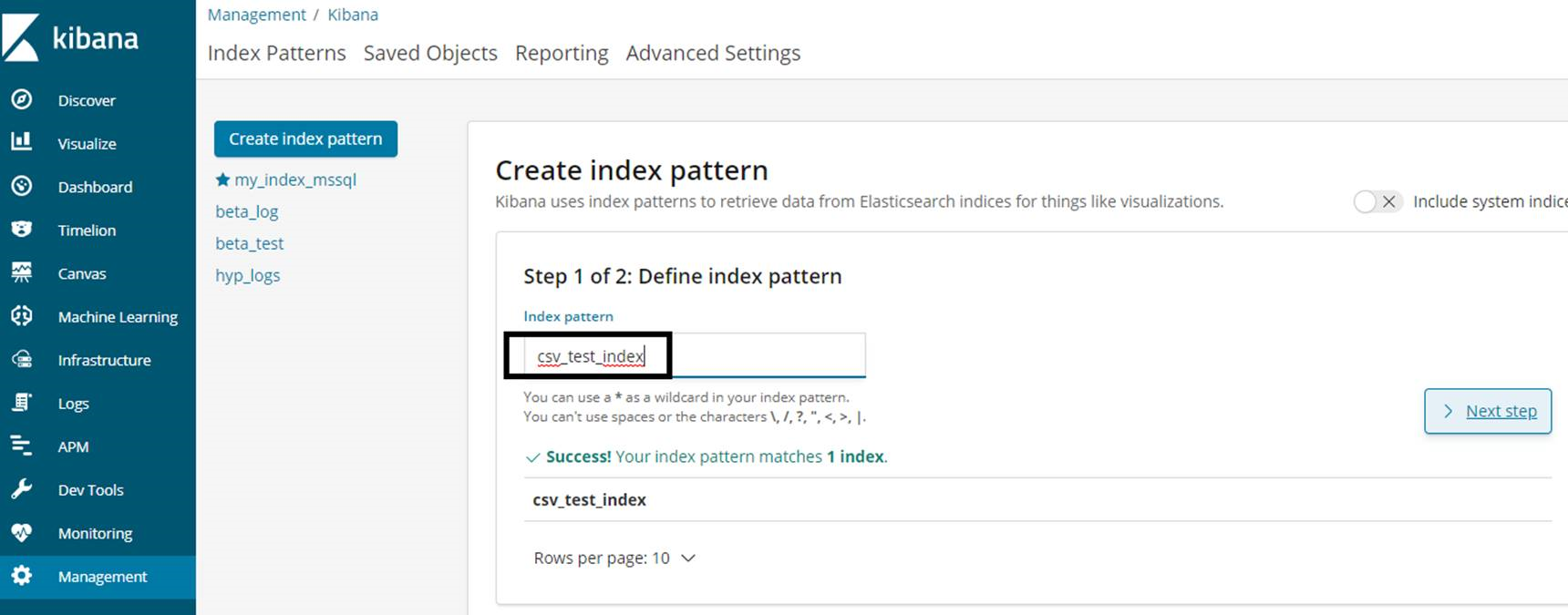
In the section marked in the screenshot below, we write the name of our index and click Next Step.
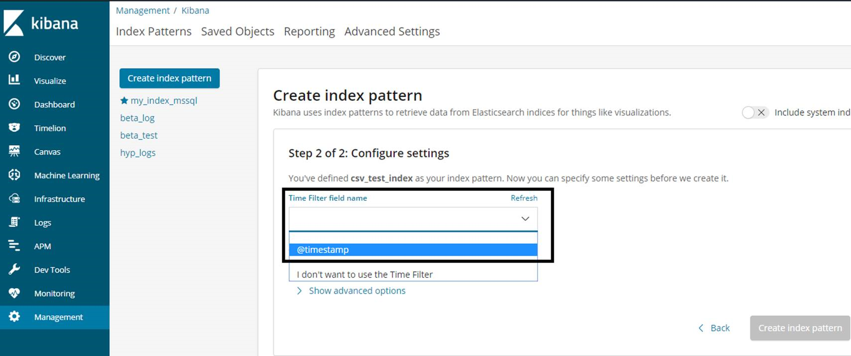
We need to select a date field on the next screen. If there is no date field in the data, we can select @ timestamp as follows. We will then be able to filter by date based on the area we selected here.
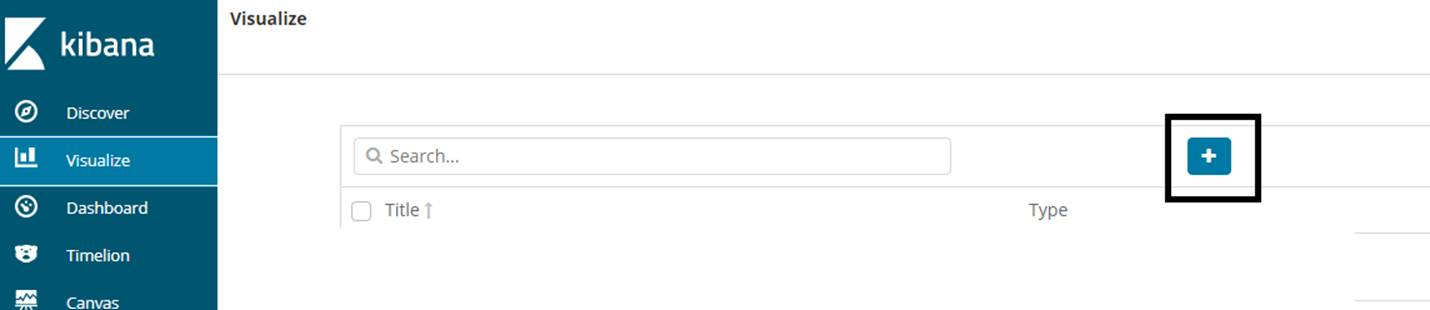
After creating index pattern, click on Visualize tab to create dashboard. Then click on the + sign you see in the screenshot below.
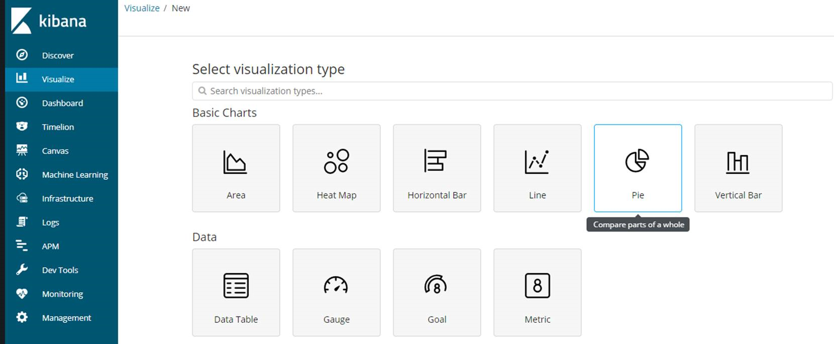
On the next screen we select a visualization type for the dashboard. We chose Pie in our example. You can create different dashboards by selecting other visualization types.
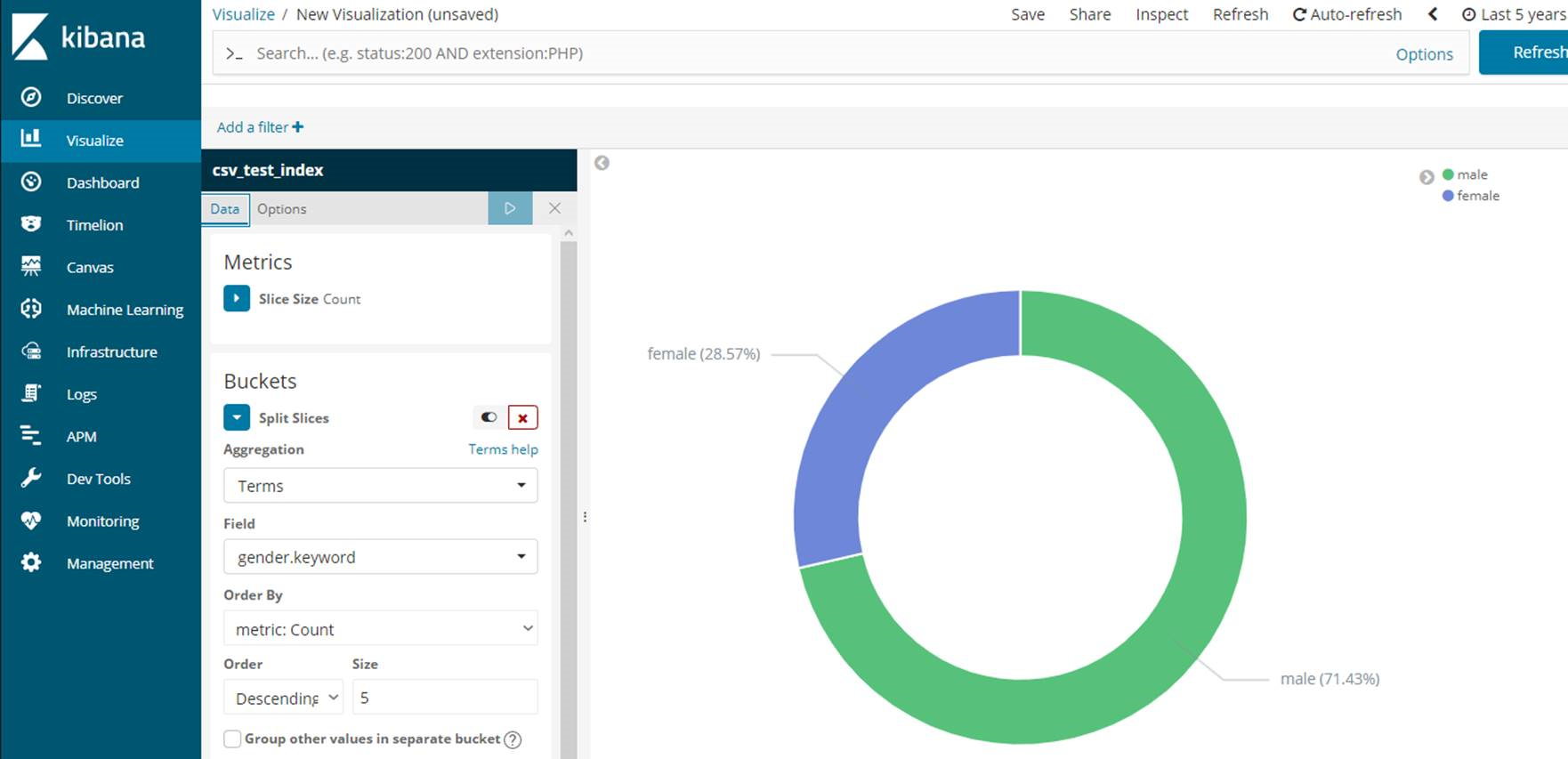
We select our index from the next screen.
We see a screen like the following. You can change the date in the upper right corner. I chose it as Last 5 years.
In the Split Slices tab;
We select Terms from the Aggregation section.
We choose Gender from the field part. Because we want to show male and female rate in pie chart.
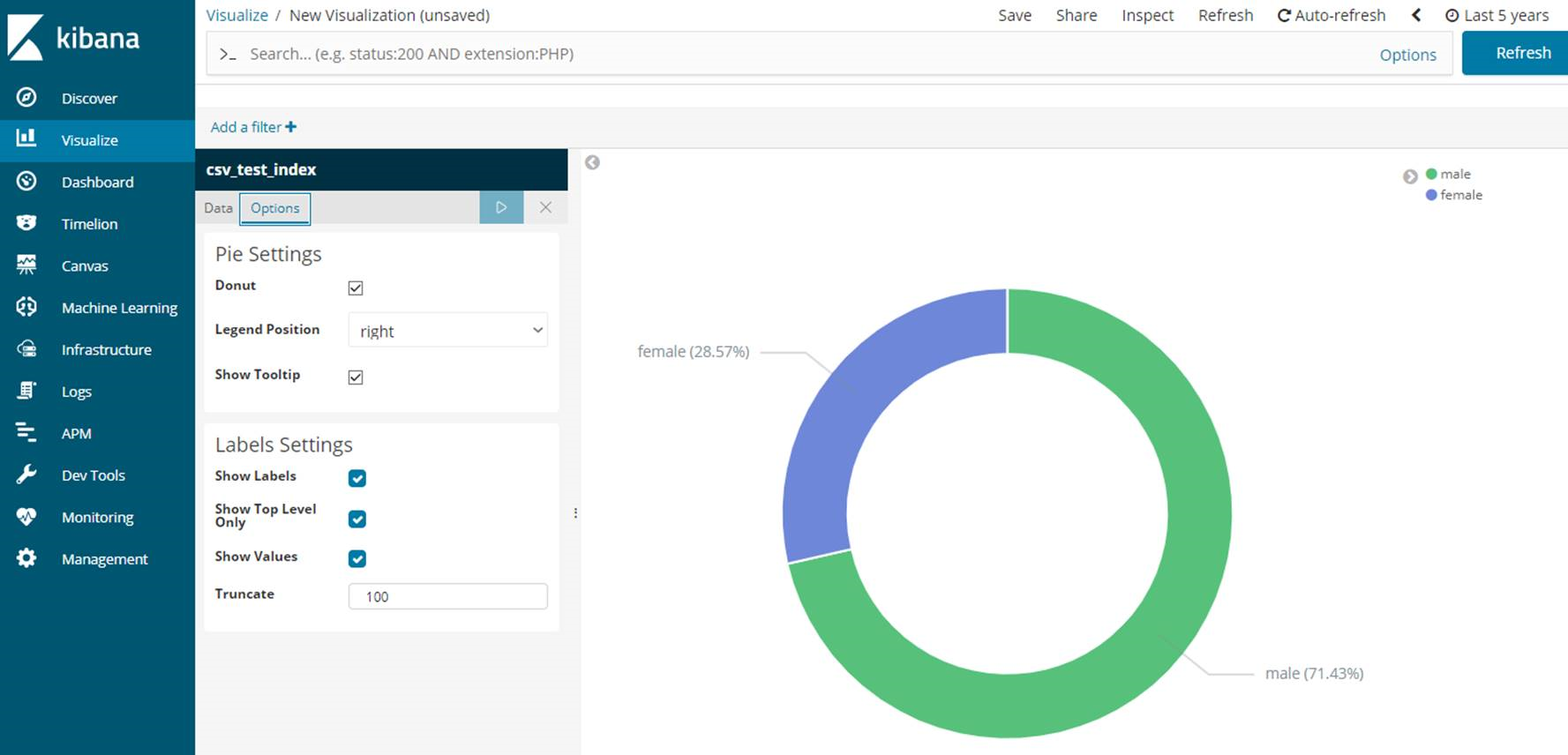
In the Options tab, click Show Labels to display the labels. Finally, click Save to save the Dashboard.
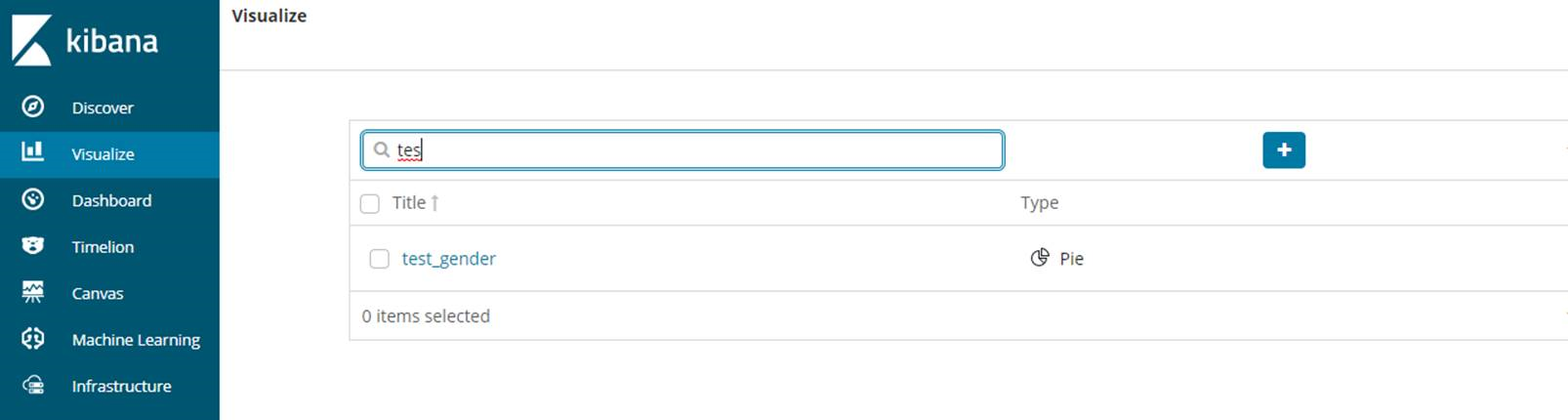
To access the saved dashboards later, we can search the Dashboard by Visualize tab as follows.
![]()